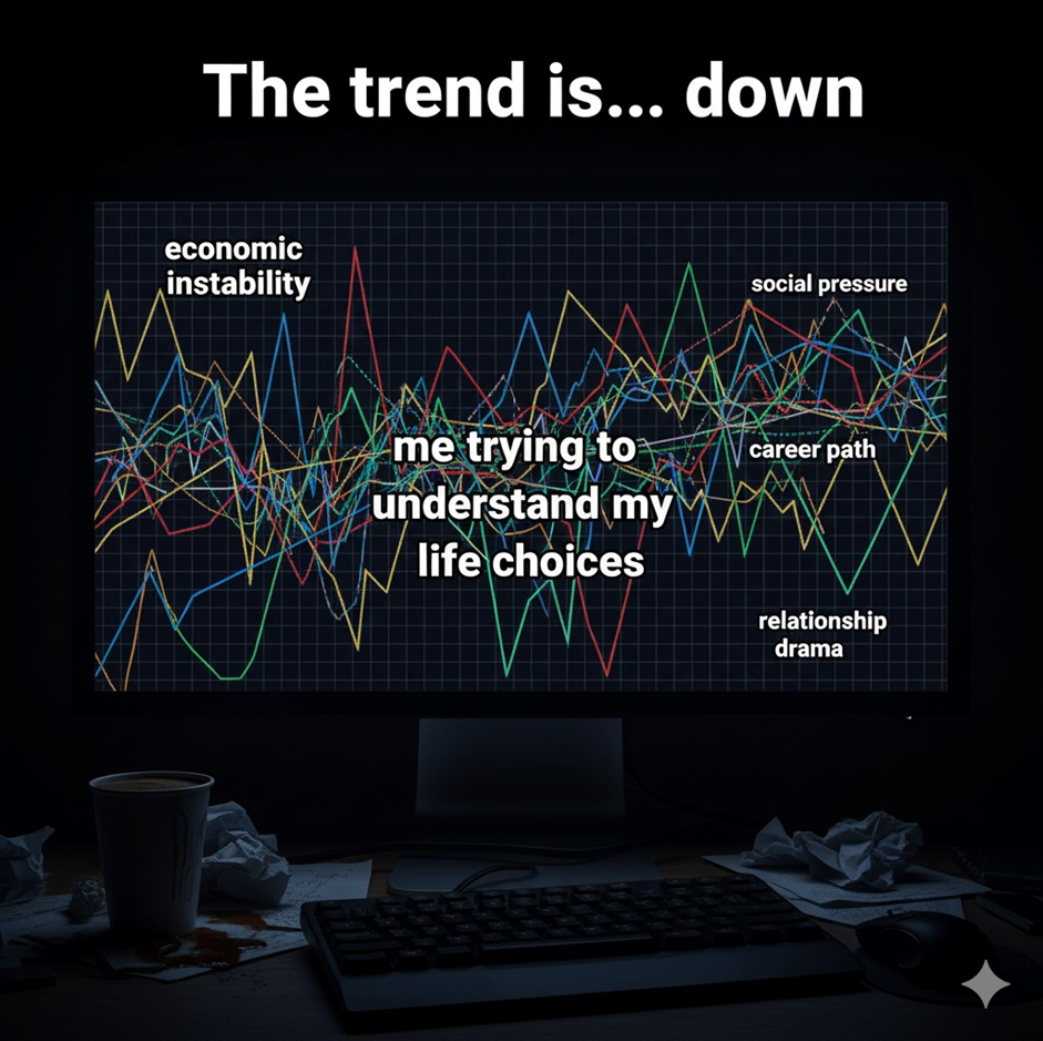
Let’s be honest: looking at stock charts makes 99% of us feel like we’re attempting to figure
out hieroglyphics made by aliens that drank espresso and took Adderall. There are
candlesticks, volume bars, moving averages, Fibonacci retracements (whatever that
means), and so many lines that it looks like a kid got a crayon on TradingView.
But here you are, acting like you’re “analyzing the market” when all you’re actually doing is
hoping that green means “money” and red doesn’t mean “you can’t afford rent anymore.”
But since every wannabe investor or influencer has to appear to know what stock charts
signify, let’s look at what they really mean—or at least pretend to, with enough sarcasm to
rival Wall Street Twitter.
Reading Stock Charts: Graphs Make Messy Things Look Better
Okay, here’s the deal. A stock chart provides a picture of how the mood of capitalism
changes over time. It illustrates the price of a stock over time, including the past, the present,
and your emotional future.
You get two primary kinds:
Charts with lines: The best companion of a newbie. A single tidy line representing the price
over time. Easy. Calm. Tells you lies about how hard trading really is.
Professionals swear by candlestick charts, which look like a jumbled, color-coded fever
dream. They show the stock’s open, close, high, and low prices over a certain time frame.
The whole objective is that they look cooler and more sophisticated.
This is how candlesticks work:
A green candle means that the stock went up, which is likely when you weren’t involved.
A red candle means that the stock went down, probably right after you bought it.
Long wicks mean that emotional damage is happening.
You will hear terms like “support” and “resistance,” which mean where the stock “tends to
bounce.” Translation: where you can be sure you’ll buy right before it drops through the floor.
Stock charts are like Tinder profiles. They seem good, say what you want to hear, and then
let you down when reality sets in.
Candlestick Patterns: Wall Street’s Horoscopes
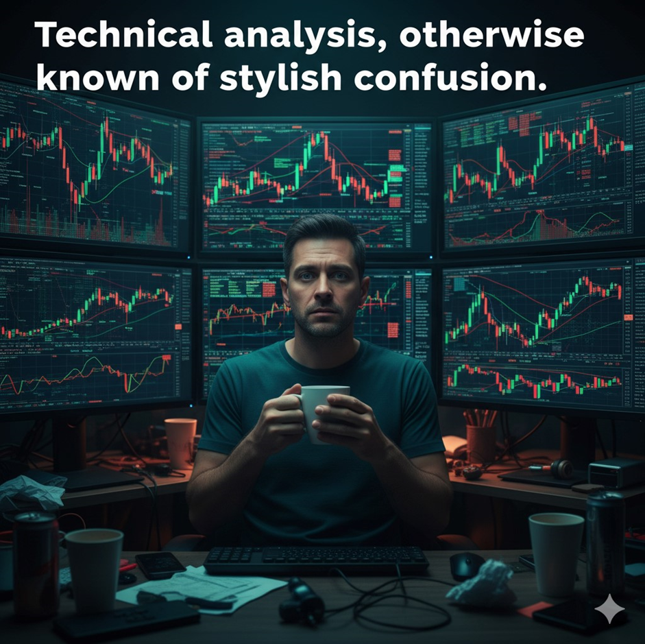
Welcome to the world of candlestick patterns, which are small forms on charts that traders
think will tell them what will happen in the future, like reading tarot cards for broke tech bros.
Here are some of the best hits:
- The Doji: A candle in the shape of a cross that indicates “no one knows what’s going on.”
It’s like the shrug emoji for trading. - The Hammer: It looks like a tiny hammer. Supposedly it means a “reversal.” In actuality, it
merely indicates you’re going to get hit hard emotionally. - The Engulfing Pattern: This happens when one candle totally covers another. Traders say
it means the trend is changing. It’s called denial by psychologists. - The Morning Star and Evening Star are fancy titles for hope and despair. They sound like
poetry, but they’re really just reasons for you to freak out at different times of the day.
It’s like figuring out the night sky when you read these patterns. When it works, you’ll feel like
a prophet; when it doesn’t, you’ll feel like a clown.
People who think they’re too sophisticated for astrology use technical analysis instead.
Moving Averages: Because We Like to Pretend Time Makes Everything Better
If you’ve ever seen a chart with smooth colored lines going up and down, you’ve found
moving averages, sometimes known as Wall Street’s emotional support graphs.
Moving averages reveal “trends” by figuring out the average price over a certain number of
days. Traders love them like self-help books:
The 50-day moving average implies that people are feeling good about the short term.
The 200-day moving average demonstrates a long-term false belief.
People act like they believe this:
When the 50-day crosses over the 200-day, it’s a “Golden Cross.” (Translation: Everyone
buys out of fear.)
A “Death Cross” happens when the 50-day drops below. (Translation: People sell their
stocks in a frenzy while tweeting about bad markets.)
Moving averages are basically lines that confirm what the price did before. They are lagging
indicators that make you feel safe while you overlook the fact that the markets are chaotic,
erratic, and sometimes full of meme stock energy.
But those nice curves are nice to look at when your portfolio progressively loses money.
How Loud the Market Is Screaming
You know those lines that go up and down at the bottom of stock charts? That’s a lot of
people. It displays how many people were buying or selling a stock, which is basically how
loud everyone was freaking out that day.
A lot of volume means drama.
Boredom = low volume.
Confirmation is when prices move on a lot of volume. When they move on a minimal amount
of volume, it’s called “denial.”
Traders treat volume like it’s a hallowed number, but let’s be honest: it’s just a way to show
how people are acting. When people think something is going up, they rush in, and when
things go wrong, they stampede out like it’s Black Friday.
You can practically hear them yelling, “It’s different this time!” if you listen closely. (No, it’s
not.)
Volume is like the stock market’s group chat, full of feelings, regret, and terrible choices.
Indicators: Because Lines Weren’t Confusing Enough on Their Own
Traders chose to add indicators to stock charts, which were already a muddle. These are
complicated equations that are meant to assist you guess what will happen next.
Some of the most common ones are:
RSI, or Relative Strength Index, tells you if a stock is “overbought” or “oversold.” The main
thing to remember is that it will keep going up when it is overbought. When it’s too cheap, it
will keep sliding down. Good.
MACD: Shows how fast something is moving. It quits operating as soon as you get it.
Bollinger Bands are the stretchy lines that keep the chart from moving around like a financial
straightjacket. In short, it states, “The price could go up or down.” (Thanks for nothing.)
You will spend hours fine-tuning these indications, marveling at multicolored chaos like it’s a
Jackson Pollock painting of money. Then a man on Reddit will tell you, “You’re doing it
wrong,” and somehow be right.
Indicators are essentially numbers that try to make sense of feelings. Spoiler alert: emotion
always prevails.
Reading Charts: The Emotional Spectrum
Stock charts are more than just lines and prices; they are emotional engineering. Every time
the price drops sharply, you rethink your decisions in life. Every spike makes you think you’re
a genius.
This is how your mind works when you look at a normal chart pattern:
“Wow, I’m really good at this” when the trend is up.
Small drop: “Is this a good time to buy?” I’m pretty much Buffett.
Sharp drop: “Don’t worry, it’s just consolidation.”
Crash: “I should have listened to my gut.” My gut feeling is always right.
Rebound: “I knew it.” I never doubted it.
You’ll go through the five stages of grieving at least three times before lunch. The stock
market isn’t about reasoning; it’s about who can stay calm the longest while claiming to know
what’s going on.
You’re not buying and selling stocks; you’re buying and selling serotonin spikes.
How to Look Like You Know What Charts Mean (Even If You Don’t)
Let’s be honest: you’ll never really “master” reading charts until you give up your soul and
half of your sleep schedule. You can, however, look like you know what you’re doing.
The secret is:
Say something like “it’s consolidating” or “it needs a breakout.” No one knows what these
signify, but they sound sophisticated.
Sigh and scroll significantly between timeframes. If you say “interesting formation” under
your breath, you get extra points.
Make lines that aren’t needed. All over. Put them in order by color for chaos. People will think
you’re a genius in the market.
Talk about “volume confirming the move.” It doesn’t, but no one will ask you.
Please say, “I’m waiting for confirmation.” What? Who cares? It sounds smart since it’s not
really clear.
Congratulations, you’ve joined the legions of retail traders who think that lines can tell the
future.
The Existential Wrap-Up: The Line Always Wins
The truth is that stock charts don’t tell the future. They are historical fiction, which means
they are gorgeous pictures of things that have already happened, with some made-up parts.
You can look at indicators, observe trends, follow experts, and tell your brokerage account
sweet nothings, but the market always does what hurts the most people the most.
We still look at charts, though, because hope is hard to resist. That one green candle might
be the start of your comeback tale or simply another fake-out that spoils your weekend.
So here’s to the charts: beautiful, complex, and humbling works of art that remind us that
we’re all only guessing.
Go ahead. Please log back in. Make another line. You can call it “analysis.” You deserve it.
Reviewed for accuracy and last updated on November 24, 2025.


